



.avif)
)%20(1920%C2%A0%C3%97%C2%A0900%C2%A0px).avif)
Have you ever spent hours perfecting content on LinkedIn, only to get three likes and radio silence? On the web, the harsh reality is that the average user's attention span has plummeted below the critical 8-second mark. Worse still: your readers read on average less than 30% of a page's content, since reading on a screen is 25% slower than on paper.
Faced with this attention economy, carousels are a weapon of choice to capture interest, provided you know how to use them. We analyzed performance data to bring you this ultimate guide. So, how can you ensure your next B2B carousel goes viral instead of being a total flop?
It's a matter of seconds: readers decide in just 3 to 5 seconds whether they will swipe through your slides or scroll past your post. Here is an unfiltered comparison between the practices that smash records and those that condemn your posts to oblivion.
What You Will Find in This Guide
- The Visual Showdown: Real Humans vs. AI Graphics / Stock Photos
- Layout & Visual Hierarchy: Designing for “Mobile-First” and “Scanning”
- Slide Sequence: Keeping Readers Engaged Until the Very End
- The Final Call-to-Action (CTA): Turning Readers into Qualified Prospects
- Pre-Publishing Checklist
1. The Visual Showdown: Real Humans vs. AI Graphics or Stock Photos
The choice of your cover image and illustrations instantly determines your audience's engagement.
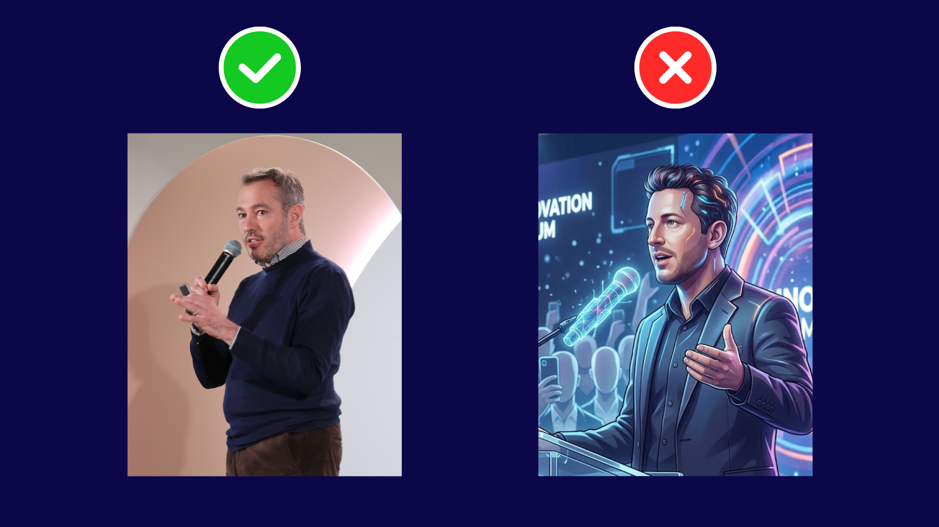
- The Flop: an excess of cold visuals or stock images. Using generic meeting photos or overly robotic AI characters disconnects the reader.
- The Viral: human authenticity or highly-framed graphics. Behind-the-scenes & team representation: use real photos! Data shows that real photos outperform AI-generated visuals by 189% higher engagement in this category. Nothing replaces human connection when it comes to establishing the credibility of a brand.
2. Layout & Visual Hierarchy: Designing for “Mobile-First” and “Scanning”
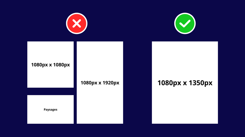
Today, over 60% of web traffic comes from mobile devices. Your slides must be designed for small screens and quick reading.
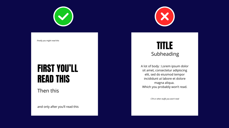
- The Flop: massive blocks of text. Writing 10-line paragraphs on a single slide instantly discourages mobile readers on the go.
- The Viral: structuring content for the “F-shaped” reading pattern. User experience (UX) science proves that we first scan the top of screens horizontally before moving vertically down the left side. Always place your crucial information and hook words in the top-left of your slides. Use ultra-short paragraphs (3 to 4 lines max), keep sentences to 15–20 words, and breathe air into your layout with bulleted lists. Put keywords in bold to make visual scanning easier for busy readers.
Visual hierarchy example: an incorrect approach uses a slide with flat hierarchy — a centered title and subtitle followed by a dense block of placeholder text that readers will skip. The correct approach uses a high-contrast text layout that intentionally guides the reader's eye, working because the user reads in a natural sequence.
3. Slide Sequence: Keeping Readers Engaged Until the Very End
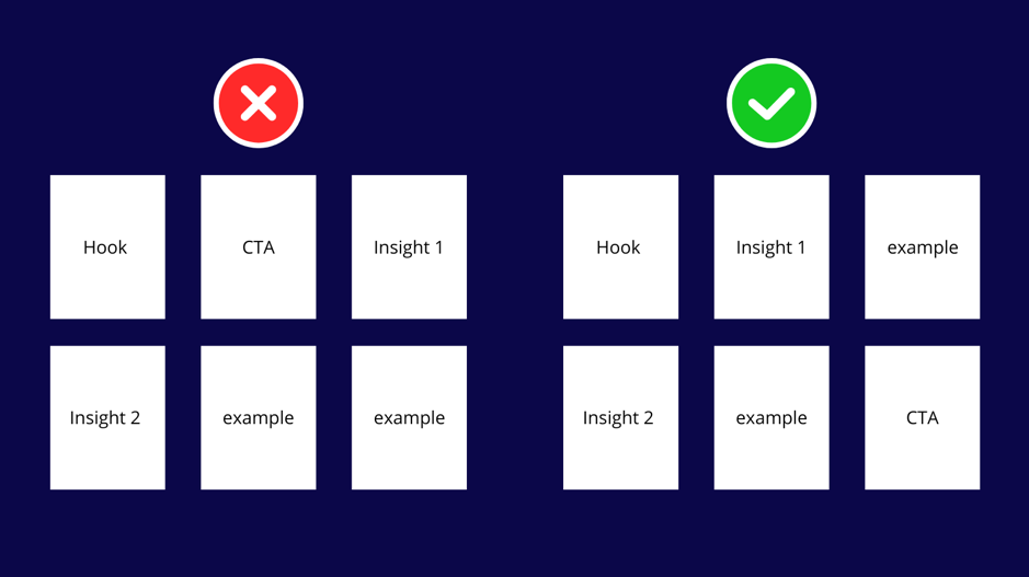
The structure of your carousel must naturally guide the user through a logical narrative journey.
4. The Final Call-to-Action (CTA): Turning Readers into Qualified Prospects
The final slide of your carousel is your sales page. For it to convert, your Call-to-Action must be flawless.
- The Flop: a vague button or a lukewarm CTA. Asking readers to like, comment, subscribe, and read an external article all at once dilutes the action and causes decision fatigue.
- The Viral: a single, clear, and highly-actionable button. Button text must be clear (so readers know exactly what they get) and concise (no text overload), remaining fully consistent with the carousel's topic.
- Action verbs: start with a strong action verb (e.g., “Download”, “Get”, “Claim”).
- Design: use high-contrast colors that make the button pop from the background while remaining complementary to your brand's style guide.
Pair it with an irresistible “Lead Magnet”!
To entice your readers to take action, offer them a high-value resource in return:
- A Ready-to-Use Template: B2B professionals love pre-packaged work. Proposing a template where they only have to fill in the blanks is one of the simplest and most effective lead magnets to create.
- An Actionable Checklist: turn your carousel's advice into a 10-point printable checklist. It provides real satisfaction as readers check off completed tasks.
- A Documented Case Study: show concrete proof of how one of your clients achieved spectacular results using your visibility strategy. Offer it as a PDF download to collect highly qualified leads.
The LAF Tip: A Canva Guide for Perfect, Seamless Carousels
Don't design your carousels using AI! Instead, use Canva, which offers a wide selection of templates or lets you build your carousel from scratch.
For a perfectly aligned, seamless carousel, use a custom canvas size of 5400 x 1350 px (for a 5-slide carousel) and set up your guides as follows: create a new design with those custom dimensions, go to File → Settings, click Add guides, then select the Custom tab and input Columns: 5, Gap: 0px, Margin: 0px. Gridlines will appear, showing you the exact boundaries between the slides of your carousel to help you design a continuous, cohesive flow.
Examples of Our Carousels
Get Started Today
To help you transition from theory to practice, our agency has prepared a turnkey tool for you. Stop wasting time and download our Viral Carousel Checklist!
Want to go further? Download our free Playbook: B2B Influence on LinkedIn in 2026 and turn every carousel into a lead-generating machine.




.png)


.avif)
